I like Liquid Glass
25 August 2025
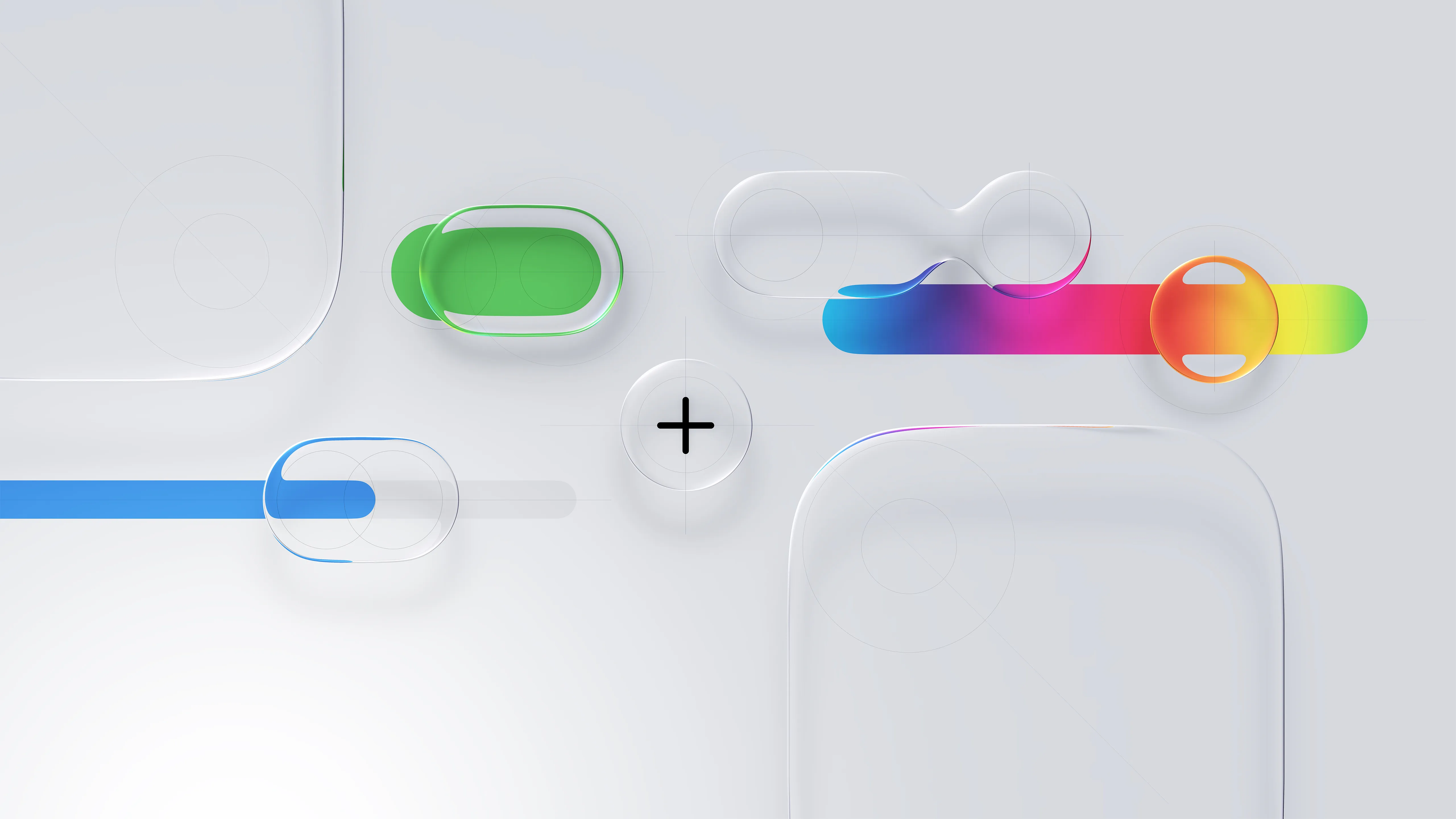
When Apple held its annual WWDC conference back in July, it announced a new design language for all of its platforms called Liquid Glass. As the name implies, the new UI elements resemble liquified glass that interacts with the content around and below it by reflecting and shaping the emitted light, giving a perception of volume to the phone screen. During the introductory video, Alan Dye explains that this evolution was only available because of the silicon revolution that Apple has gone through by bringing its chip development in-house - and I believe it. Refracting light efficiently is not easy, and one can assume that Liquid Glass implementation is using ray tracing to calculate how light should behave. It’s a visually beautiful effect and it’s fun to see how Apple is exploring how to apply the new metaphor across use cases. But it wasn’t received well by tech enthusiasts in general.
The number one criticism made by designers after the announcement was the lack of legibility. In specific scenarios, especially when the content behind is noisy, it becomes hard to read labels and the button in general blends in, making it difficult to distinguish itself. On following beta releases, Apple has improved elements that were visually problematic, and is actively updating areas of the OS where Liquid Glass implementation is not refined. One could assume that these improvements might take years to settle, based on past design updates experience with iOS 7. What’s interesting is that designers have been asking for more skeuomorphism ever since iOS 7 landed, complaining that it brought too much flatness. And I think that’s what Liquid Glass delivers, a new skeuomorphic metaphor that extends the material we primarily interact with when using our devices: glass.
What I like the most about Liquid Glass is the fact that it adds volume to the glass screen I’m touching. It feels like the OS interface is part of the hardware while the content renders below it. It’s not only elegant, but it’s flexible enough to support the myriad of different ways people interact with their devices. Even though I understand the legibility concerns, I think we’re still going through the figuring-out part. Sure, there are questionable decisions being made, but I’m excited about the future that Apple designers are trying to lead us towards.